9 Important Tips for Your Future Modern Web Design
Web Design
29 Jun 2024
Your leads can only go away if your website is well-designed. They will look out for your competitors, which will cause you to lose customers to your competitors.
To get leads, your website should be designed aesthetically to mesmerize the visitor and engage with him. This will ultimately lead to the leads staying on your page which ends in more conversions for your business. The following will help you to discuss the 9 important points that can improve your modern web design company in Qatar today:
1. Determine Your Site’s Purpose and Goals
First of all, no matter whether you are doing it for a client or your portfolio — you should have a general idea about what to achieve when building out designs. While every website aims for the most beautiful design and best possible user experience, it must also meet (and increase) a core demographic.
Sometimes clients will have their purpose, goals, and objectives defined, as well as branding (including logo/ style guide) complete with content ready to drop into a CMS. But many others will either need you to build a new site or redesign their current one on your own.
To have clear goals and scope of the website or web page as well, you need to know the why, the what, and the how behind it.
2. Design your brand identity.
A brand today could mean business or personal branding. This includes your visual identity — like color scheme, typography logo design, and so on— as well as what people feel about you overall.
For example, usually, a company you are designing the website for has its own colors and brand identity provided in the style guide — such as logo variations (full color on white bg/white on any section background), typography scale to use, etc. However, if you have a blank slate to start from, there are several key elements at play: color scheme typography imagery voice, and tone.
3. Design your wireframes and rough copy for the website
Wireframes are mockups that layout design assets during the website design planning phase. They are the equivalent of concept art that outlines the structure and flow of a web page by a web design company in Qatar.
Wireframing allows you to lay out your content so that, before injecting images, lengthening copy, or embellishments (such as animations or parallax scroll effects), a structure is underpinned. Through wireframes, you also ask yourself how the content will be navigated by site visitors and what in turn should lead or spoon-feed to certain sections of data.
4. Visual Hierarchy
Visual Hierarchy – Similar to simplicity, having a visual hierarchy makes sure that you arrange and organize elements on your website so visitors see the most important things first.
Keep in mind, your end goal with usability/UX optimization is to guide visitors towards a particular action take – but do it through organic and preferably enjoyable experience. You can make viewers see specific elements before others simply by displacing them and adjusting their color or size in how you food your website.
5. Implement contact forms and social media links.
Visitors to a site should be able in touch with the business quickly, which may mean by social media or contact form. These should appear where your customers anticipate, such as at the bottom of a page or on its Contact Us page. Add social media platform integrations (For example: an Instagram account) with the option to create a CTA button that includes your phone number.
Create opportunities for your target audience to engage with you in multiple channels if warranted, so you can respond directly to their inquiries and support the development of trust between those who seek knowledge, information, or advice.
6. Set up a proper navigation.
You need to have a site structure that users can understand so they can convert and find the information quickly.
Apply these seven navigability best practices:
- Set up menu categories and clear, relevant names across the website.
- Follow menu conventions (About, Services Contact, etc) so users are aware of what to expect.
- Add A Search Bar To Your Site So Users Can Access What They Want From Every Page
- The footer should have a navigation bar so that they don´t need to scroll up all the way to go back.
- Track user paths with breadcrumbs so they can easily backtrack their steps
- Copy should have links – link with readable text
- Show prices upfront (so customers don’t have to contact you just for price.)
7. Include visual elements
Visual elements that stand out to grab the user’s eye and break up text so people scan your website. They also show customers visualizing themselves utilizing your products in their lives every day.
Thus, what are the best practices for website visuals by a web design company in Qatar?
- Choose your pictures from the wire-frame stage of website design. Instead, take unique images, and wherever possible use high-quality photos of your products/employees/premises to create a more genuine feel that can only help in establishing trust.
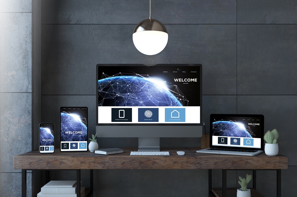
- Ensure images are responsive (fit on different devices), and optimized so as not to slow your site, with alt text for SEO and accessibility.
- Animations work well for directions but limit the size of these files to prevent slowness.
- If your business references seasons, keep up to date by cycling images through with each new change in contractor services you provide so users have the latest handiwork available for view.
8. Create a simple homepage.
When you run search engine optimization (SEO) or pay-per-click (PPC) ads, most of the time your traffic ends up on a homepage to simply learn about what it is that you do. Once they get there, they can navigate through your site to find more specific information. But the homepage, like every representation at first glance of your brand, can be a valuable place where you inform leads about what it is that makes you oh-so-special.
Simple – yet Effective homepage You never want to overburden your visitors with too much information. Leads are not generated from busy websites. The elements on your homepage should appeal to your audience. You focused more on what visuals you need, as opposed to a wall of text. The more your visitors stay on, the better they learn through these visual elements.
9. Include calls to action (CTA)
At the end of the day, your website is all about convincing people to do something (whether that be giving up their email address to get a lead magnet, or purchasing an actual item). Effective CTAs can convert a prospect into a customer.
Here are some call-to-action best practices for attention-getters:
- Use white space around CTAs to let the eye find them — do not bury them in text.
- Direct incoming leads the right way by having an offer connected to every page. Users should not have to go back and convert on your home page.
- Internal pages like the About page, and Productivist you can also include CTAs.
- Have one CTA for the same action to not confuse or irritate users.
Final Thoughts
By focusing on the principles, you can ensure that your design will be good even if it goes out of style tomorrow. It is following these web design best practices that can help you build a great UX and allow users to reach their goals efficiently on your site. You can also seek help from any web design company in Qatar.
Place the UX on top of all your planning, designing, and wherever else you involve users in a partake-like way with services/products — leave them out at your (statistically significant) own risk; they bite. Knowing the way users truly interact with your site will help take you to that road of success.
Recent Blogs
-
 09 Mar 2026
How to Localize Your Marketing Strate...
-
 09 Mar 2026
Smart Tips for Selecting a Web Design...
-
 03 Mar 2026
Why Your Business Needs a Professiona...
-
 02 Mar 2026
How Do Web Design Agencies Improve Us...
-
 18 Feb 2026
Website Redesign Services in Dubai – ...
-
 09 Feb 2026
Dubai eCommerce Development Services ...


